Package Upgrades
Helping customers understand their options and increasing upgrade rates
What is Escapes.ca?
Escapes.ca is a Canadian online travel agency focused on selling all-inclusive vacation packages. The platform distributes pre-packaged offers from airline/resort partners—bundling flights, accommodations, and transfers into a single purchase. Escapes operates on a commission-based model, earning revenue on each booking.
Growth Designer
As the sole designer, I was brought on to improve Escapes’ booking experience and uncover design-led opportunities to increase revenue. Partnering closely with the CEO and engineering, I analyzed user friction, modeled business impact, and validated high-impact solutions through testing.
Team: Mike (Growth Design), Sean (CEO), Najam (Engineer), Travel Agents (Domain Consultants)
Impact
2% Lift in AOV
16.9% lift in Revenue
✨ AI-Accelerated Workflow
Discover
Moderated Usertesting to uncover pain points and opportunities across entire booking journey
Drafted scripts, synthesized transcripts, and surfaced recurring pain points, cutting time by ~60%. [Perplexity]
Synthesize
Affinity mapping → Journey mapping,
to get high level view of problems and opportunities across entire Journey
Synthesized findings in hours instead of days (~70% faster), accelerating insight generation.
Define
Competitor pattern analysis and Problem framing to get a clear understanding of problem
Cut competitor analysis time by ~50%, enabling quicker identification of key players (and in-depth info on each)
Align
Vision mock, rev hypothesis, stakeholder pitch to get buy-in
Design → Test → Iterate
Mockups of full user flow and all states, tested with real users then iterated on
Launch + Monitor
Feature live with analytics setup to monitor performance
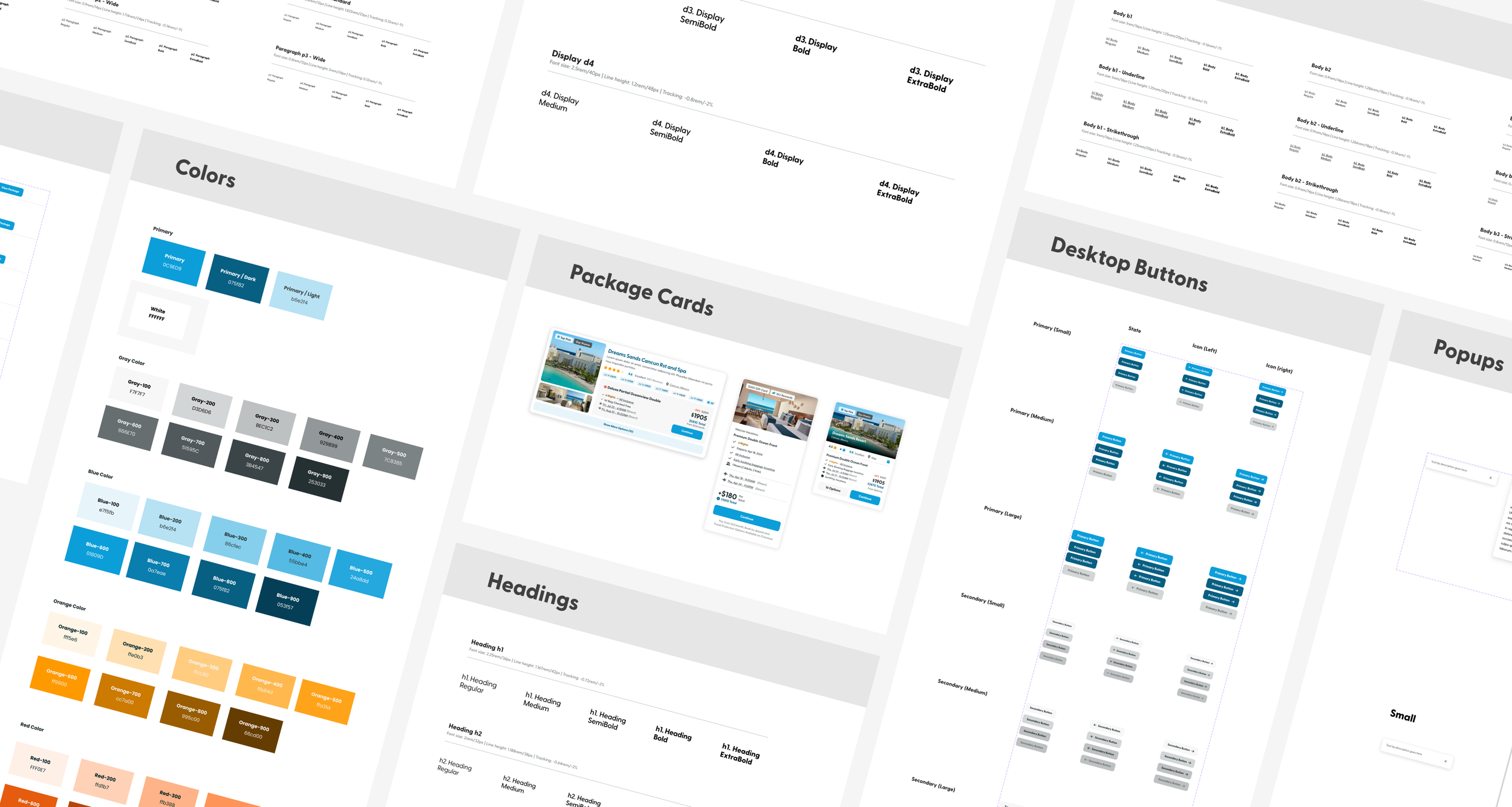
Mapping Friction & Revenue Opportunities
Conducted moderated testing across the full purchase journey and synthesized patterns into a current-state journey map, surfacing systemic friction and high-impact opportunity areas.
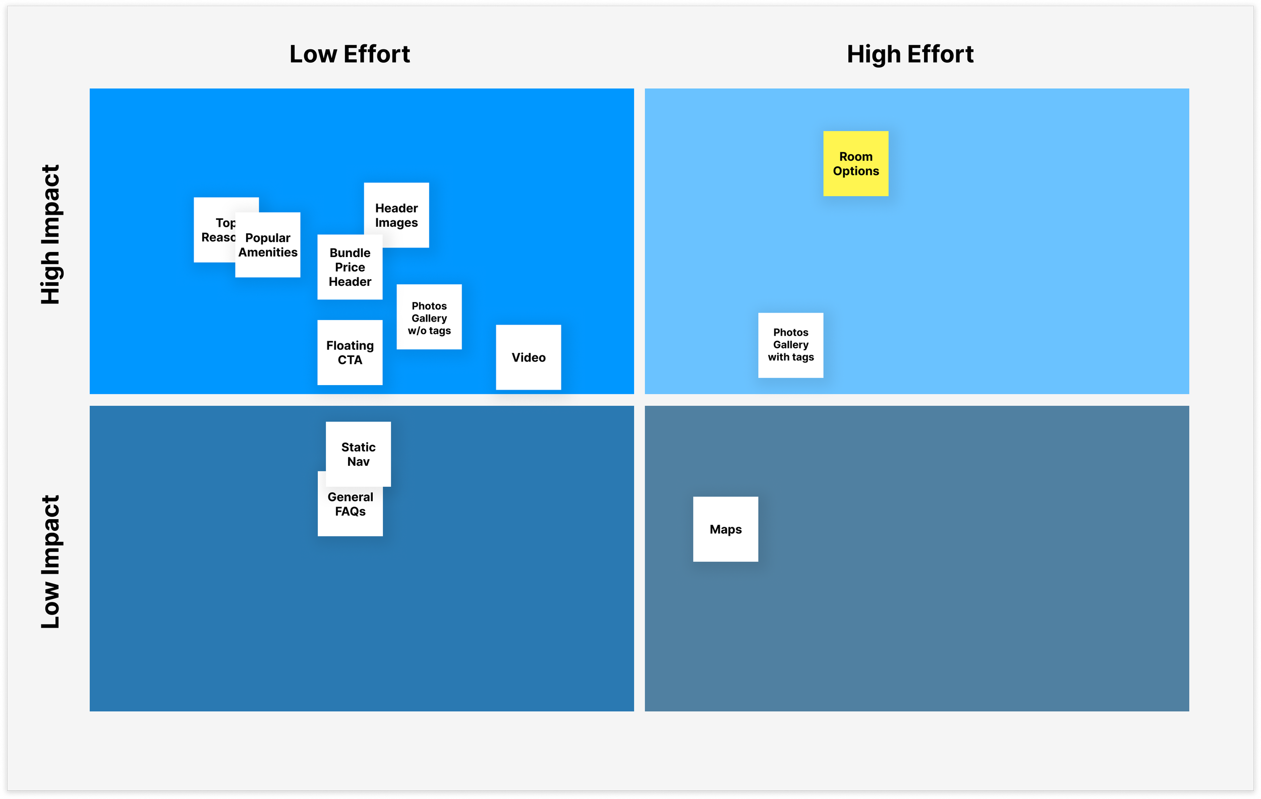
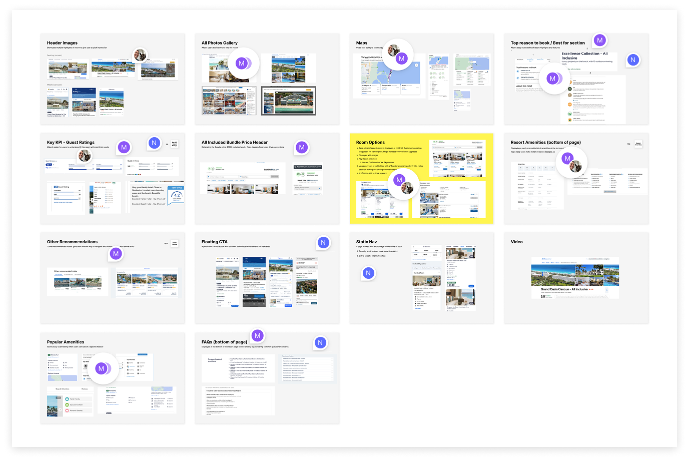
Prioritizing a High-Impact Opportunity
I prioritized a core issue—users struggled to discover upgrade options. With potential to transform the booking flow and unlock higher average order value, it became my first focus.
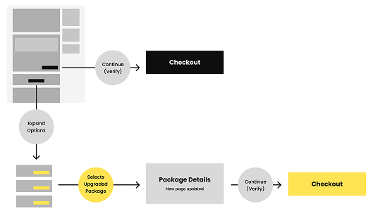
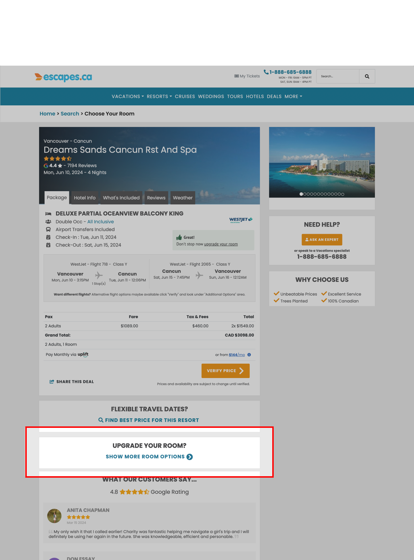
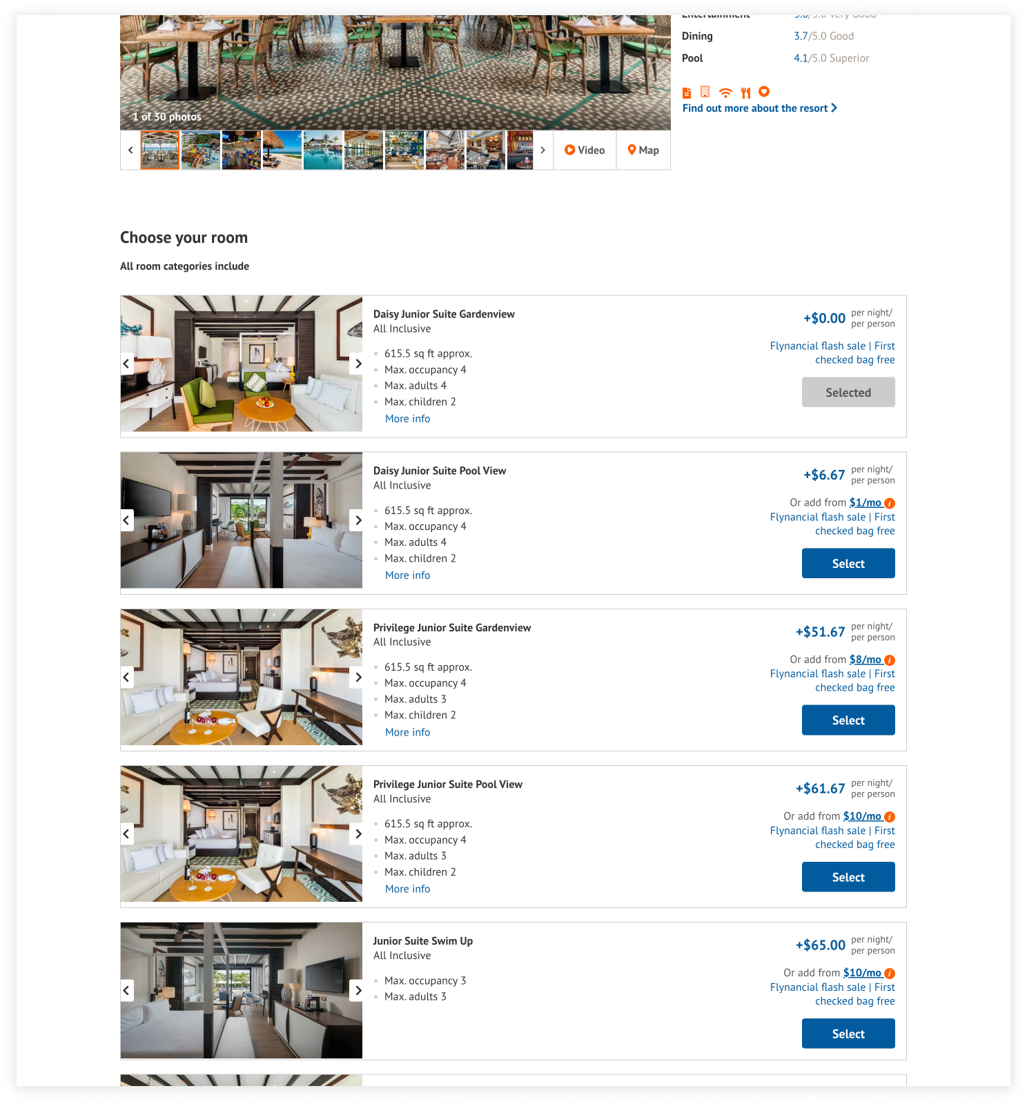
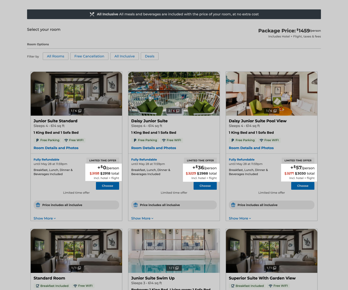
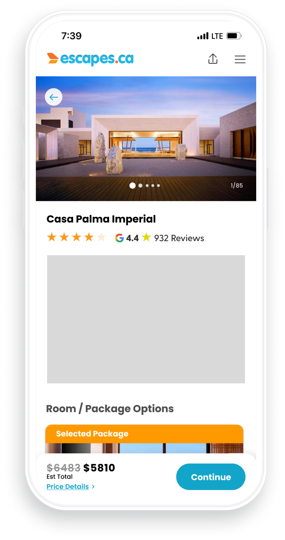
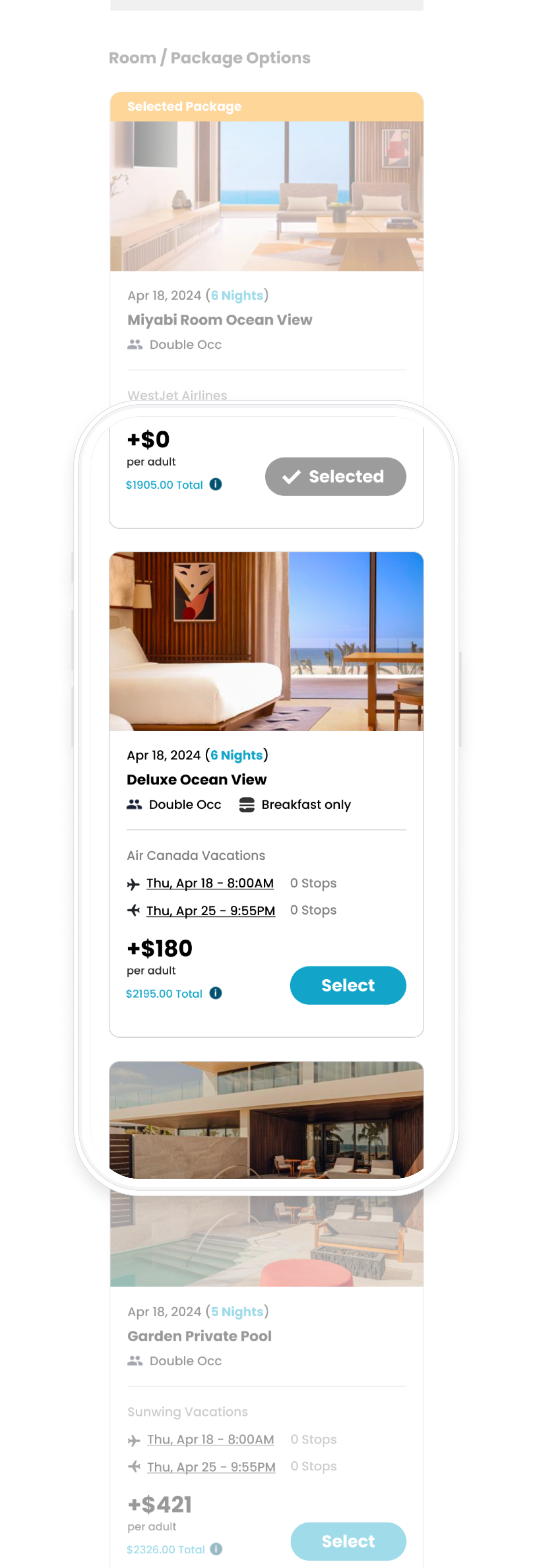
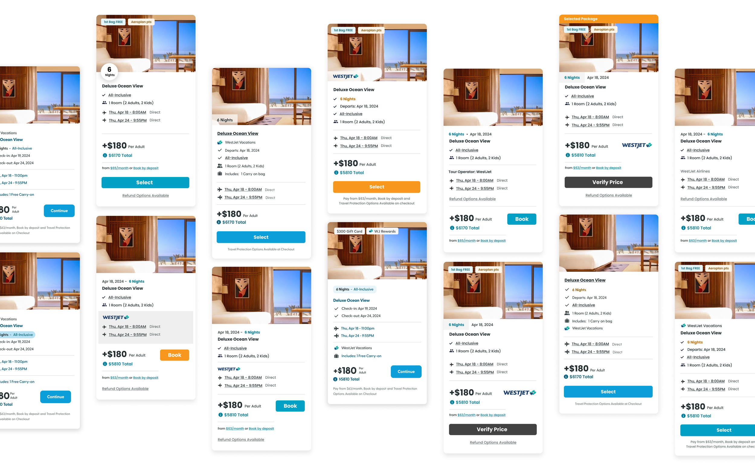
Resort Page [Current State]
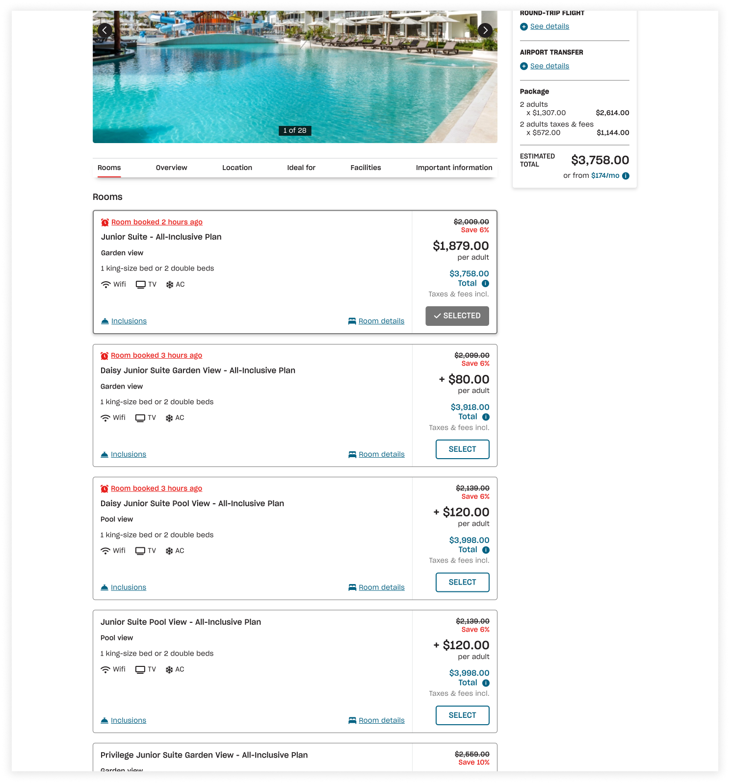
On the previous resort pages, alternative upgrade options were hidden behind an accordion. This design made it difficult for users to discover higher-end rooms, often leading them to either book a standard (cheapest) option or leave the site to find better options elsewhere.
The Common Pattern
Competitors display packages upfront, encouraging higher-end selections
[Direct Competitors]
Pre-set vacation packages
[Indirect Competitors]
Customized package options bundled live
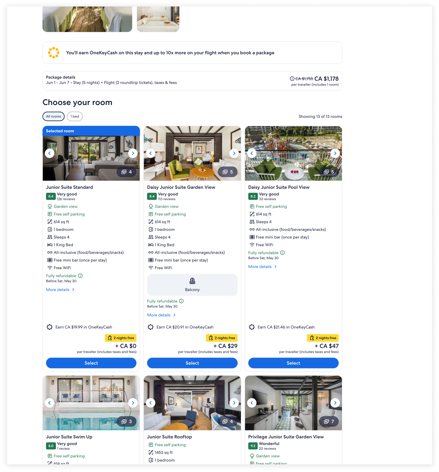
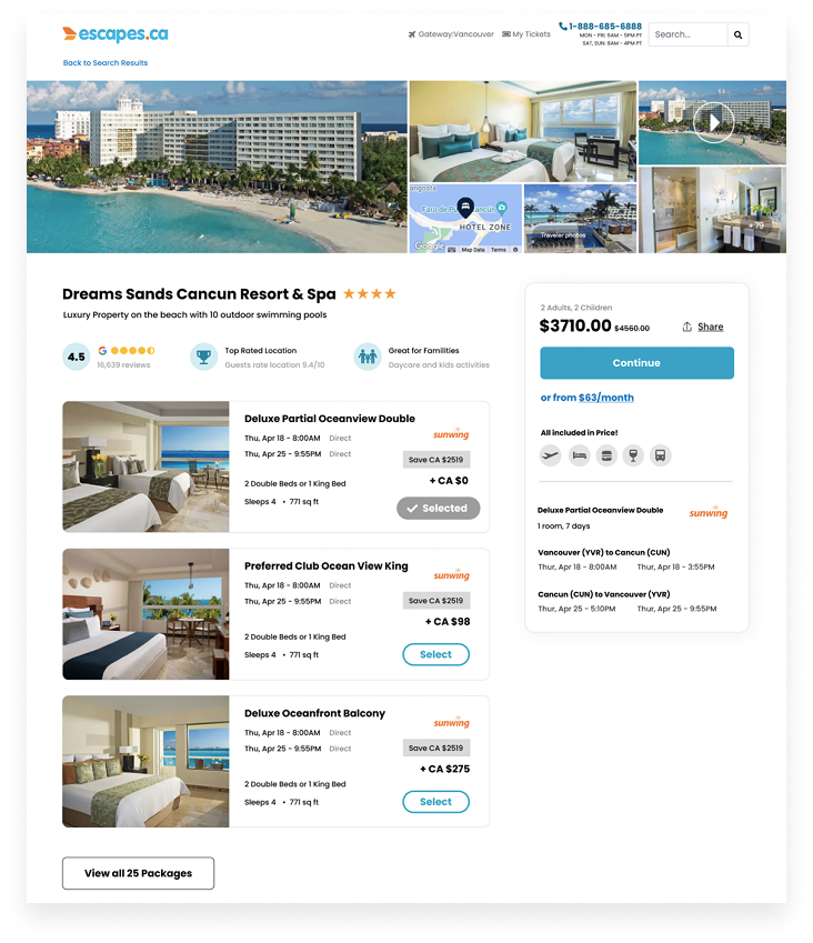
Differential Price Framing
Competitor pages show packages side by side, framing upgrades as a smaller price jump
Customer Problem
Users struggle to discover upgrade options, making it hard to compare packages and sometimes leading to abandoned or suboptimal bookings.
Business Problem
Hidden alternative/upgraded options limited revenue by reducing upgrades and lowering average booking value.
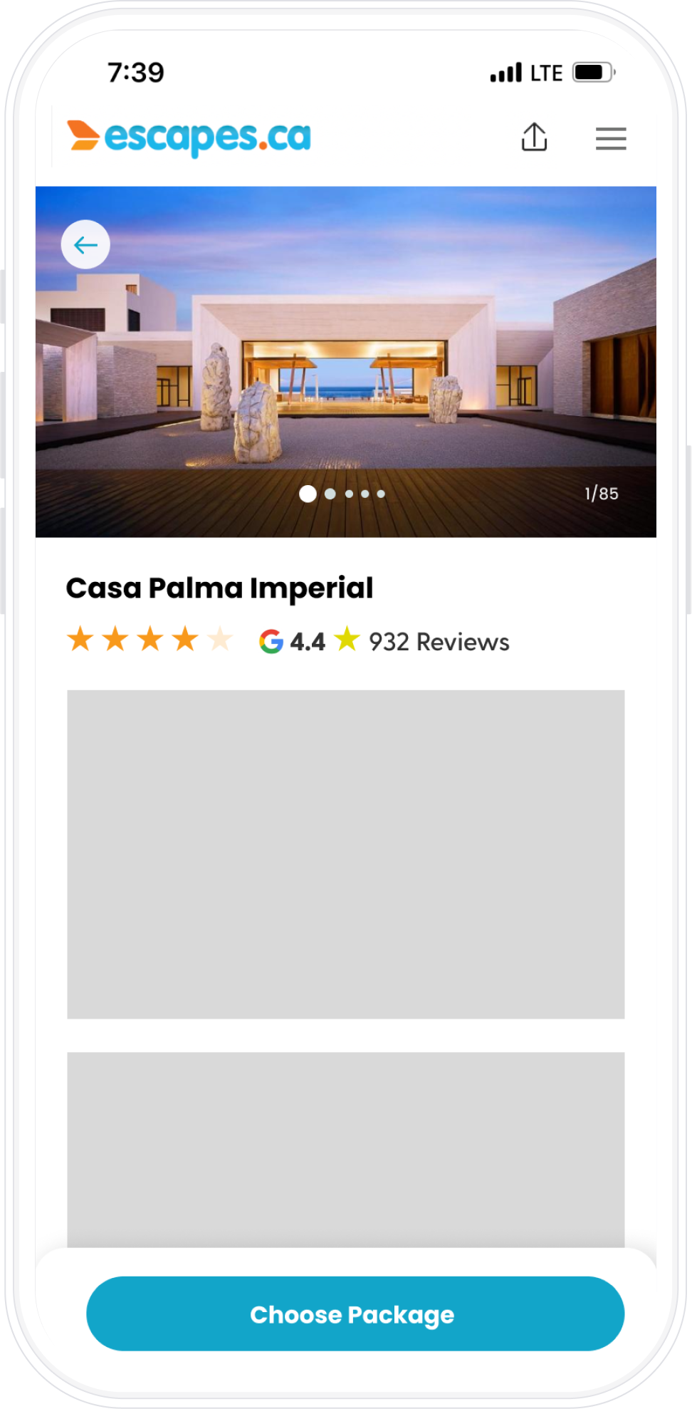
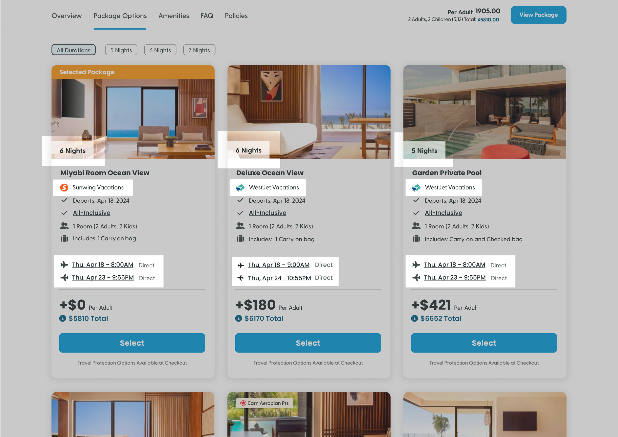
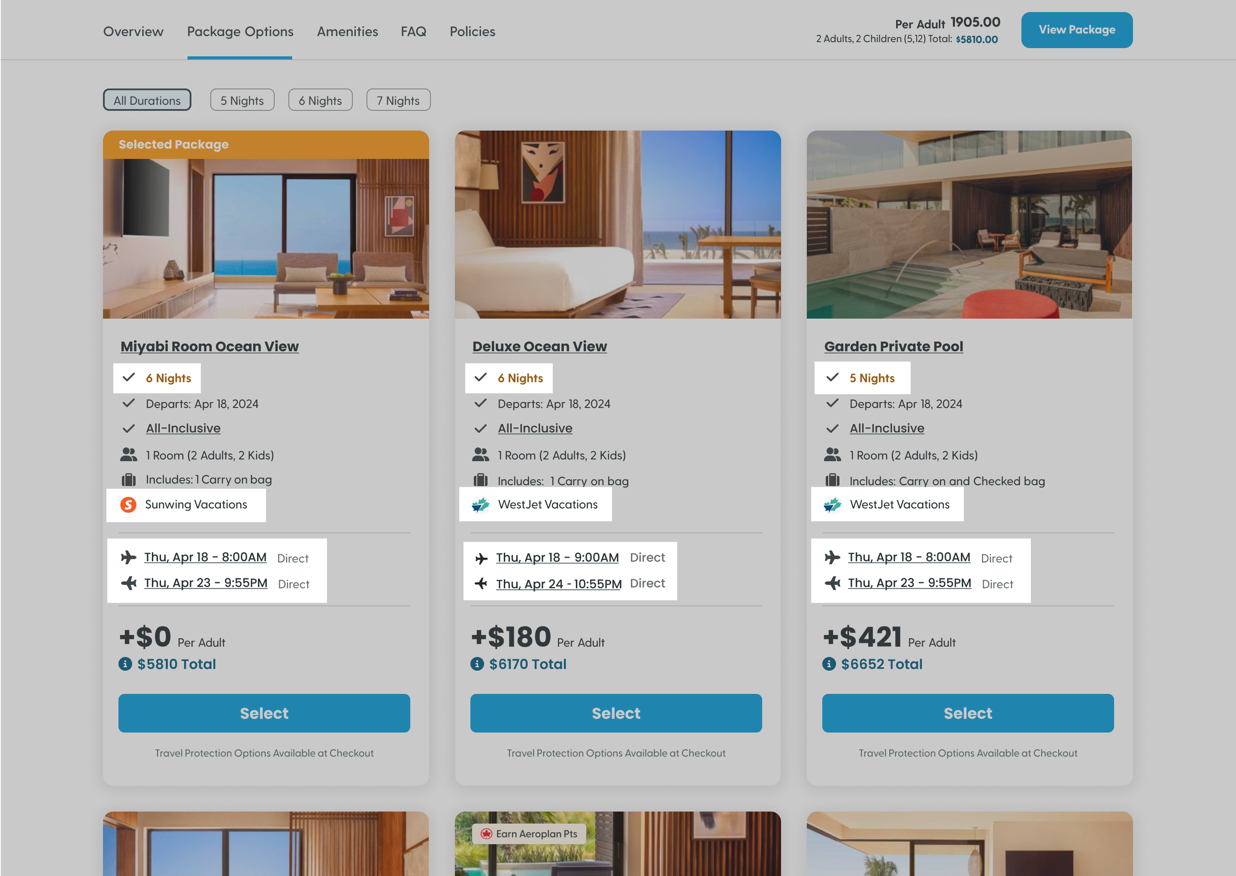
Early Concept Mock
A quick prototype secured buy-in before full design exploration

Hypothesis
Displaying all room options upfront with differential pricing increases visibility of premium rooms, and we expect 5-15% of users to upgrade or select an alternative package they might otherwise have missed, boosting revenue.
Added to Collaborative Board
Added the mock to a shared Figma board to evaluate each ideas development feasibility and potential impact before moving forward
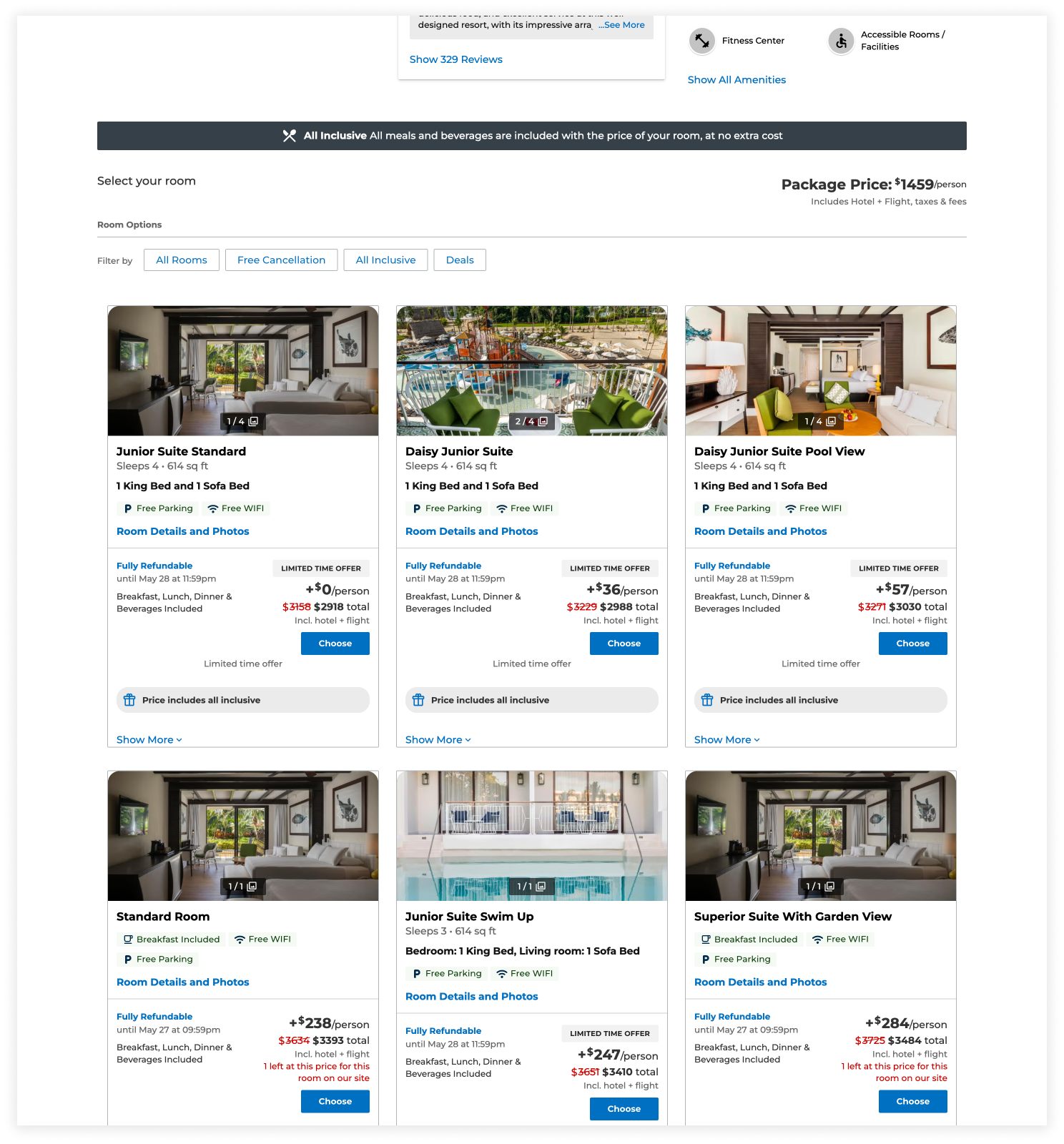
Quick Win Experiment
Displaying all package options upfront drove a 330% increase in upgraded option page views—a quick-win revenue lift before the full redesign.

Control
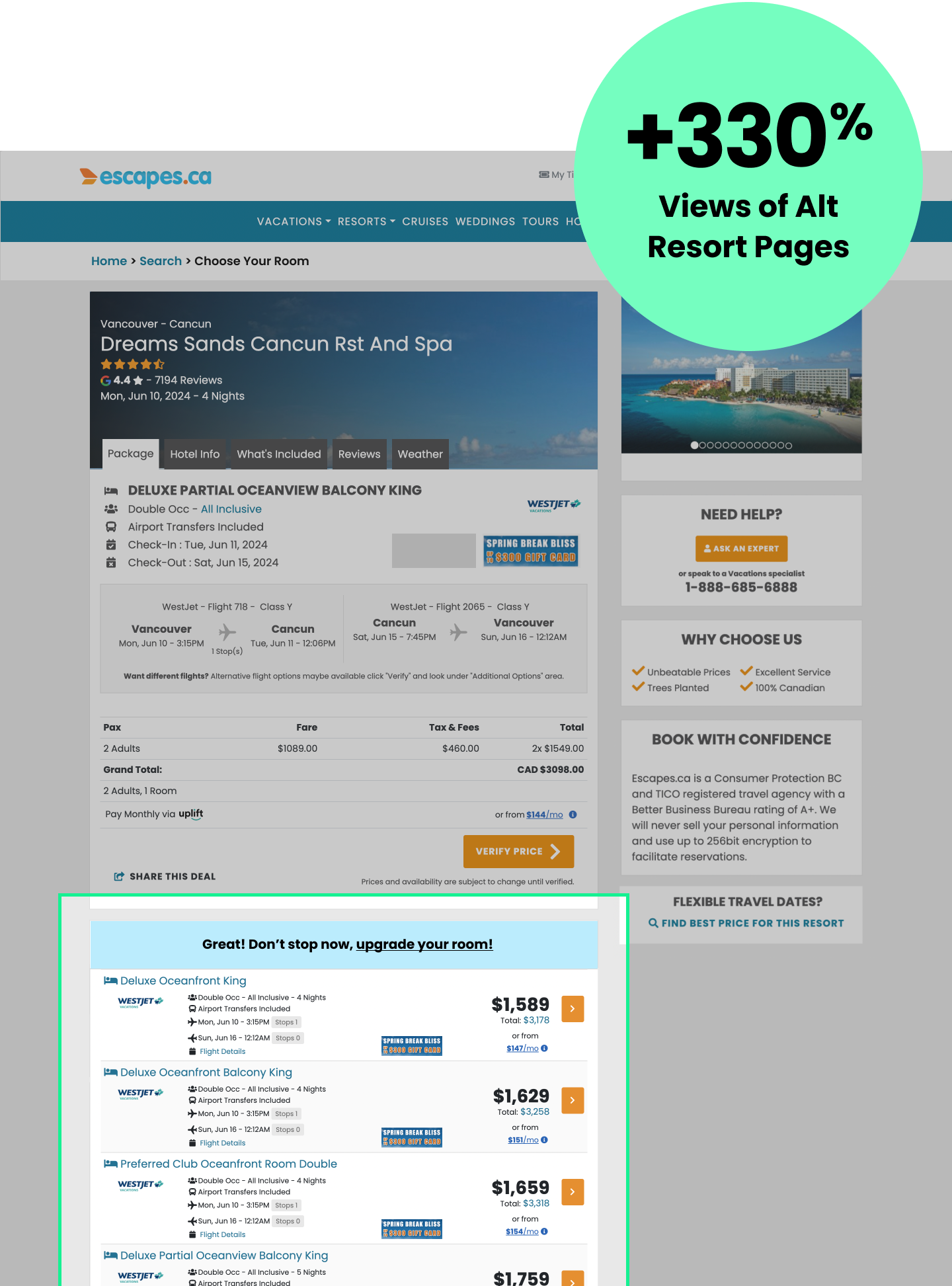
Var A
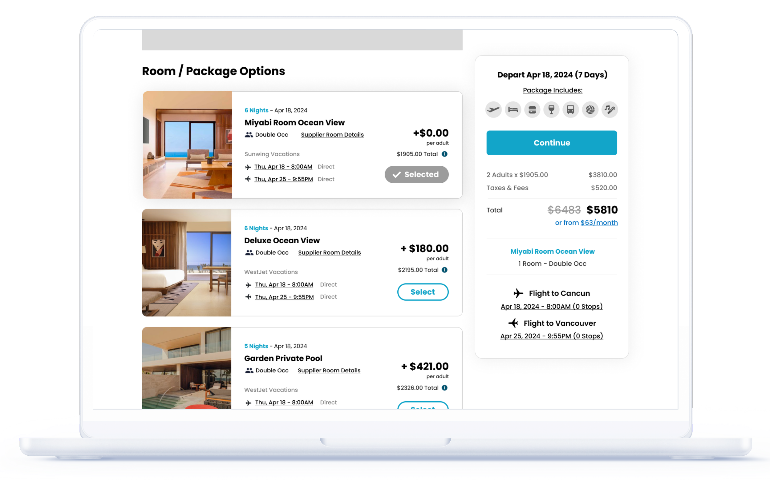
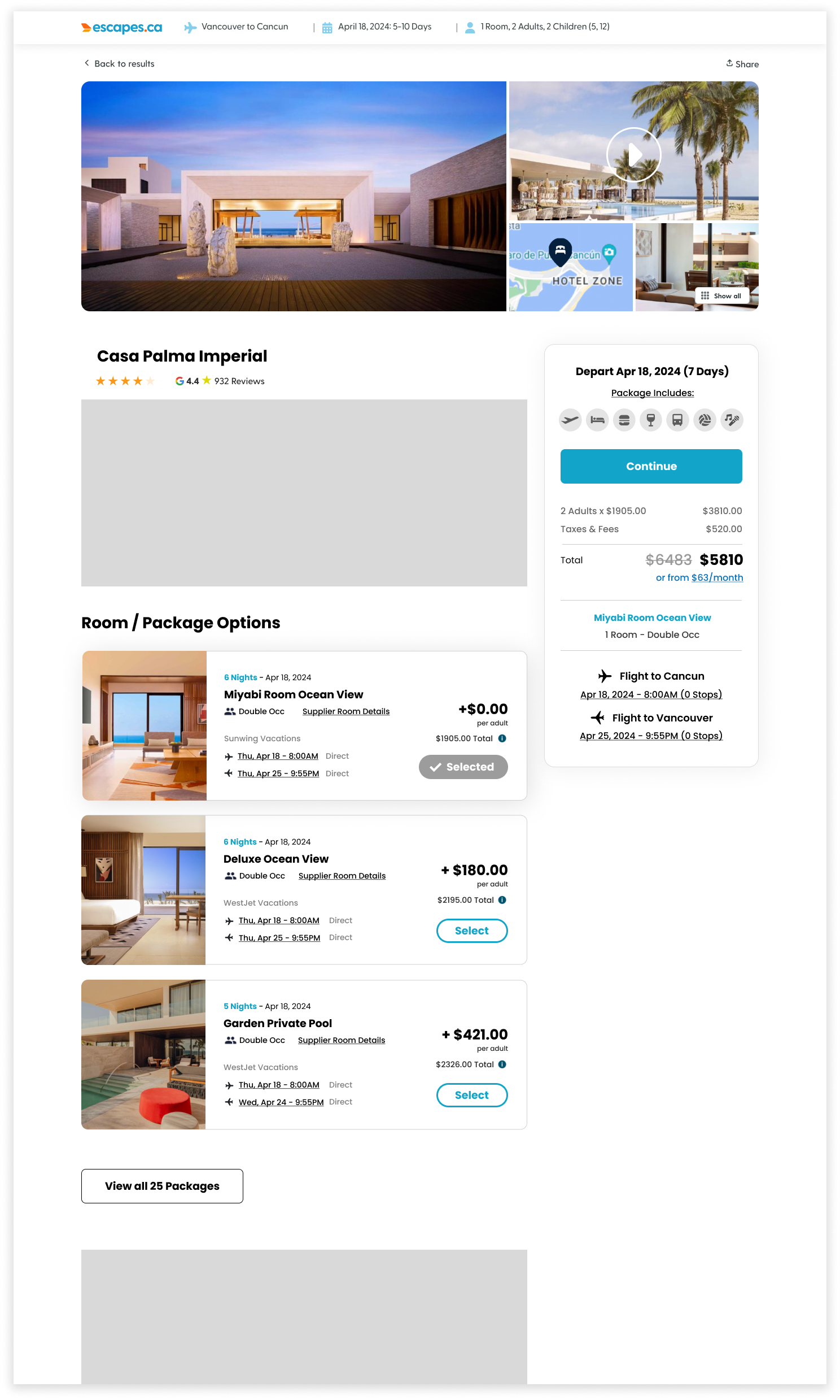
Design Prototypes
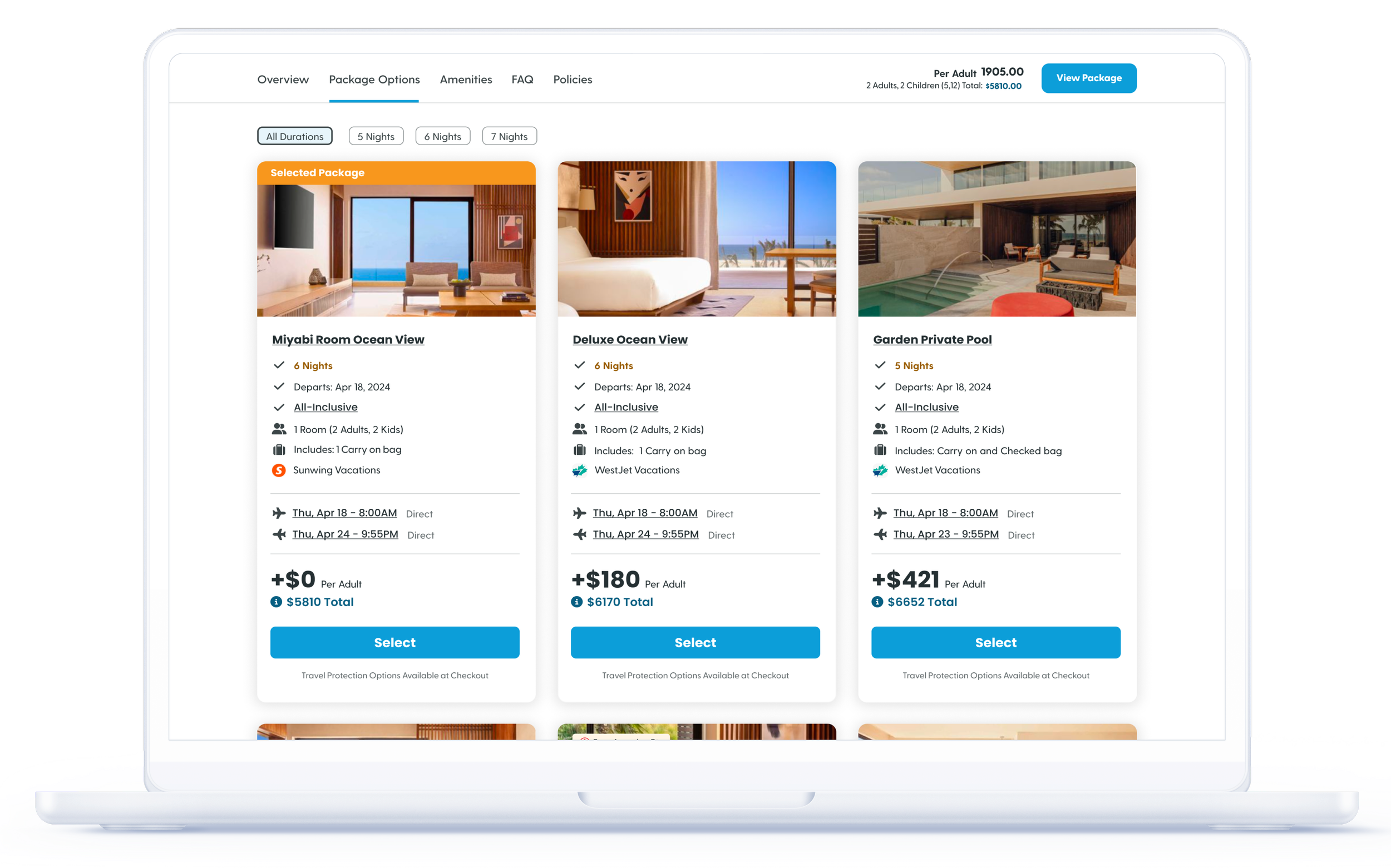
Once prioritized, I explored the full user flow, designing layouts and interactions while considering every possible state. Rapid prototypes were created for both desktop and mobile to ensure an optimal experience across devices.
Desktop
Approach #1
RHS Summary/Horizontal Cards
✔ Faster to checkout
Featuring the preselected package above the fold on the right-hand card lets users booking the lowest-priced option proceed with one click.
✖ Harder to scan
Horizontal cards make comparing options more difficult.
✖ Extra Clicks for Upgrades
Selecting an upgraded package requires two clicks to checkout.


Approach #2
Floating Price Summary
✔ Easier Comparison
Side by side cards let users quickly scan and compare dates, flight times, and costs.
✔ Better for Large Inventories
Organizes multiple packages efficiently, reducing scrolling.
✔ Familiar Layout
Matches patterns used by leading travel sites, making it intuitive.
✖ Extra Step to Checkout
Users must scroll and click “Book” to proceed, adding friction for those choosing the baseline/preselected package.
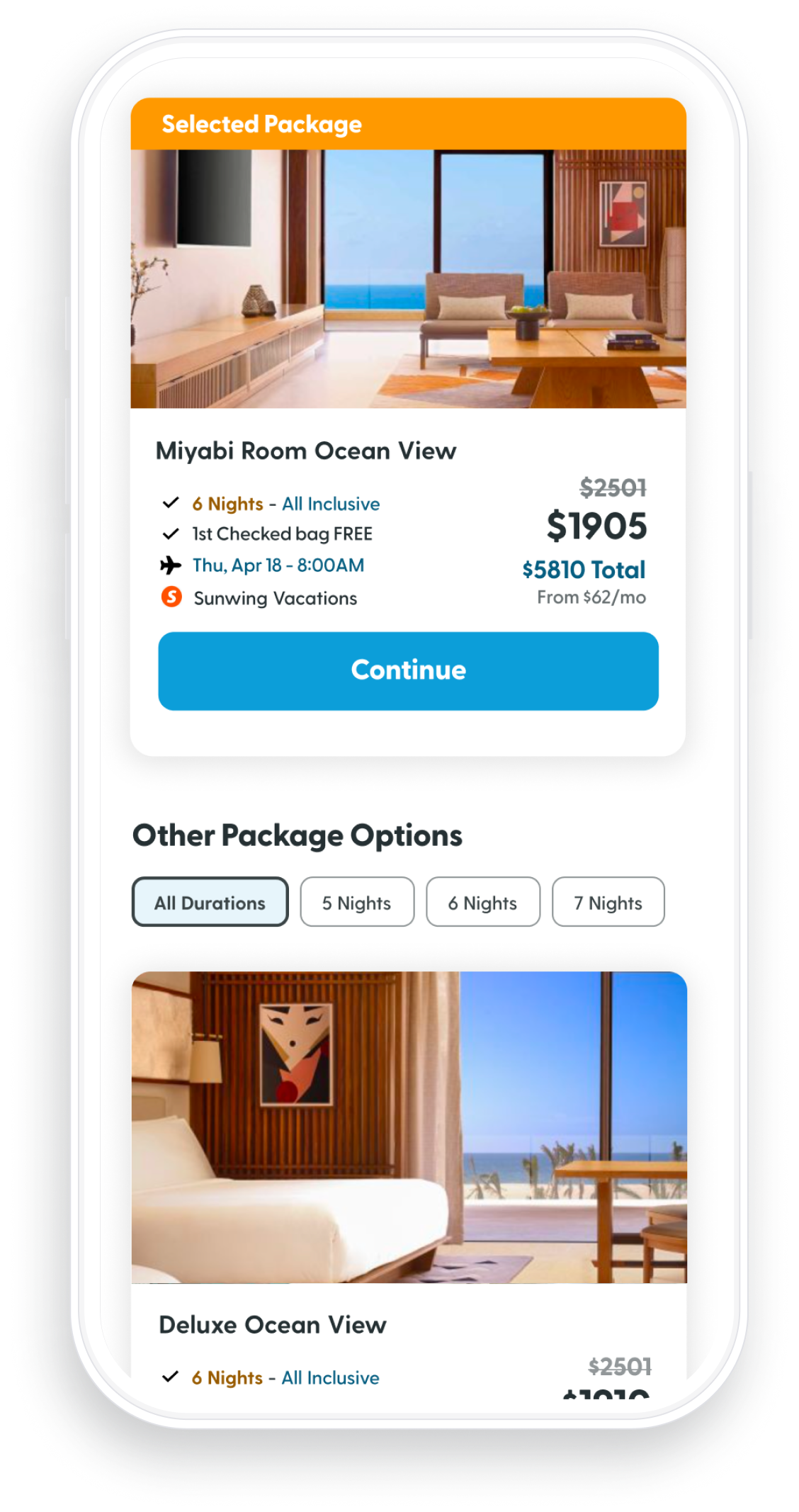
Mobile
Approach #1
Static CTA
✔ Faster to checkout for Users who buy preselected
Featuring the preselected package in a static bar lets users book the lowest-priced option with one click.
✖ Extra Clicks for Upgrades
Upgraded packages require two clicks to checkout, creating friction—especially on mobile.
Floating Price Summary CTA
Approach #2
✔ Doesn’t require select/deselect interaction
Selecting packages on mobile is easier, as users don’t need to double-click to update their choice.
✖ Packages hidden under fold
All package options are below the fold, requiring users to scroll to book and see alternatives.
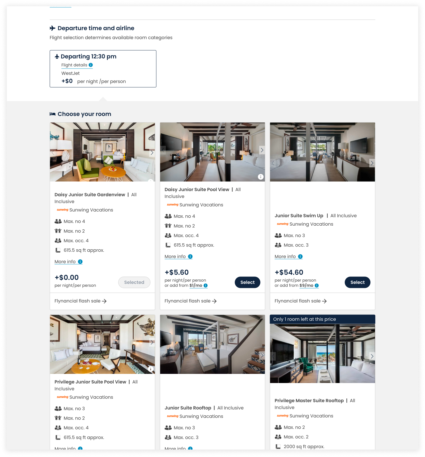
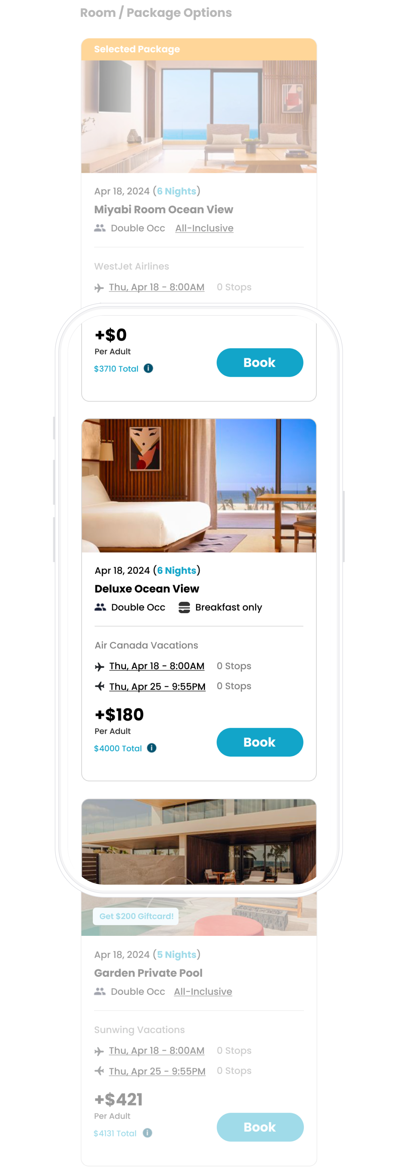
Upgrade Pricing Variations
We evaluated three pricing display approaches
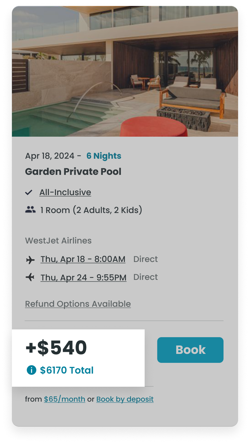
Total Cost to Upgrade
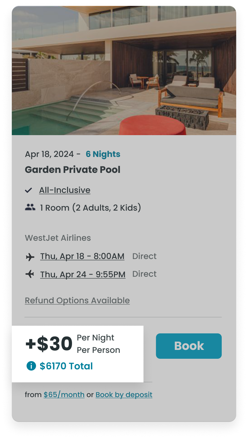
Per Night / Per Person
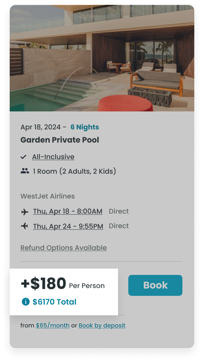
Per Person
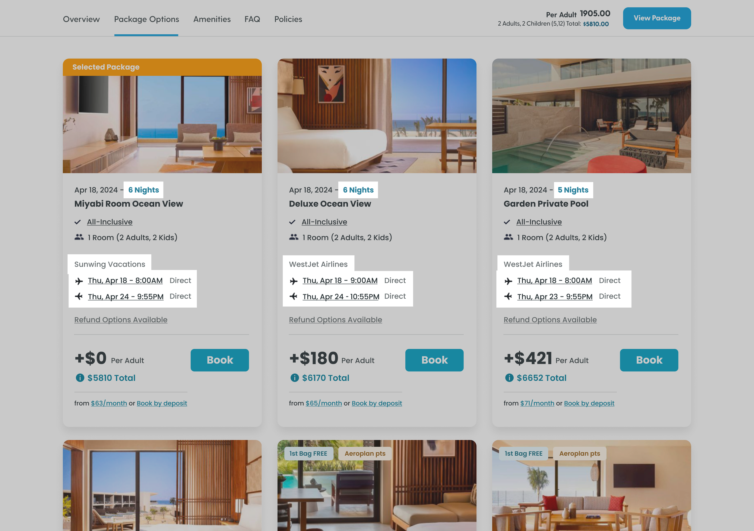
Users Missed Critical Package Differences
Prototype Testing
In prototype testing, all five users did not recognize key differences between packages: trip duration, supplier and flight times. In some cases, higher-priced options even offered less nights than the base package without users realizing. This confirmed the need to more clearly surface package differences to improve scannability
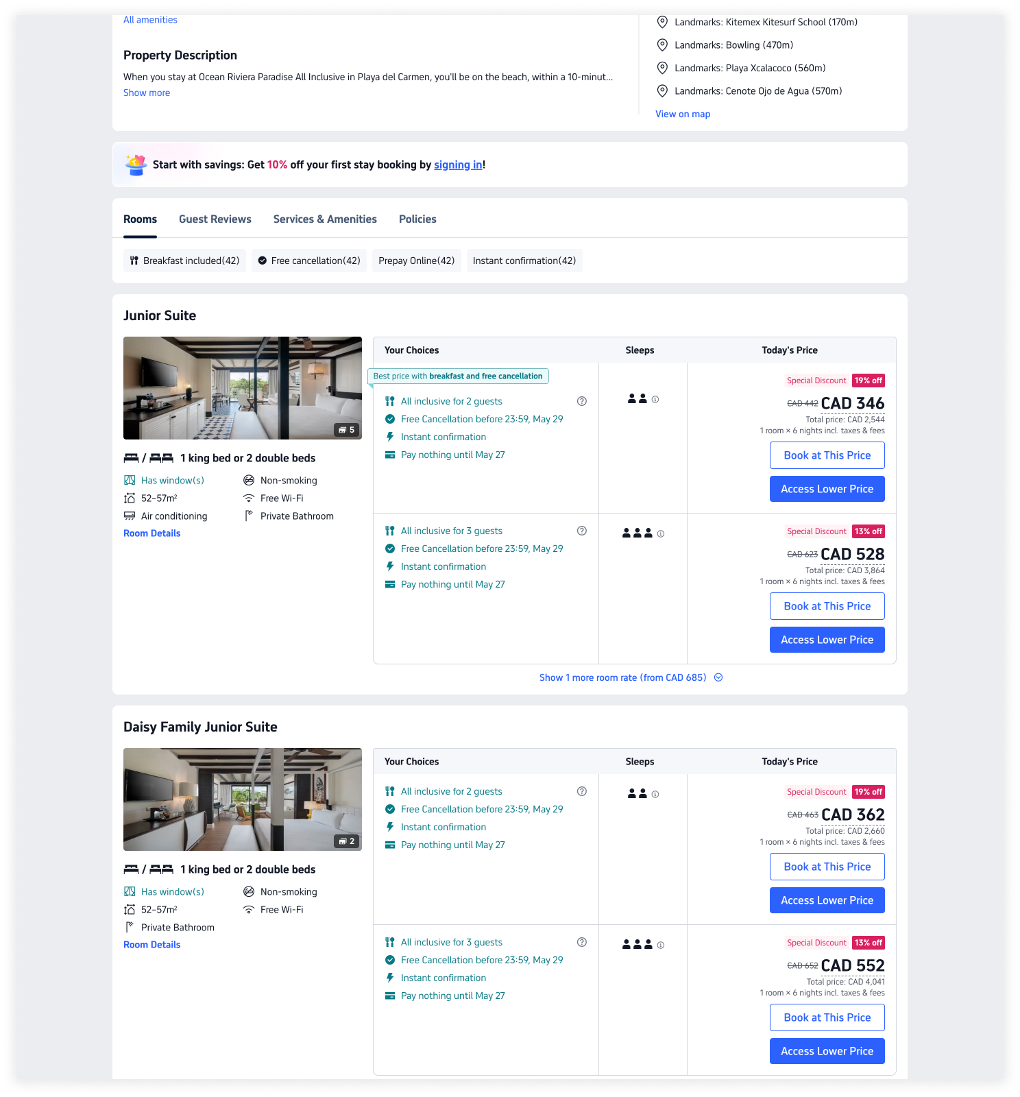
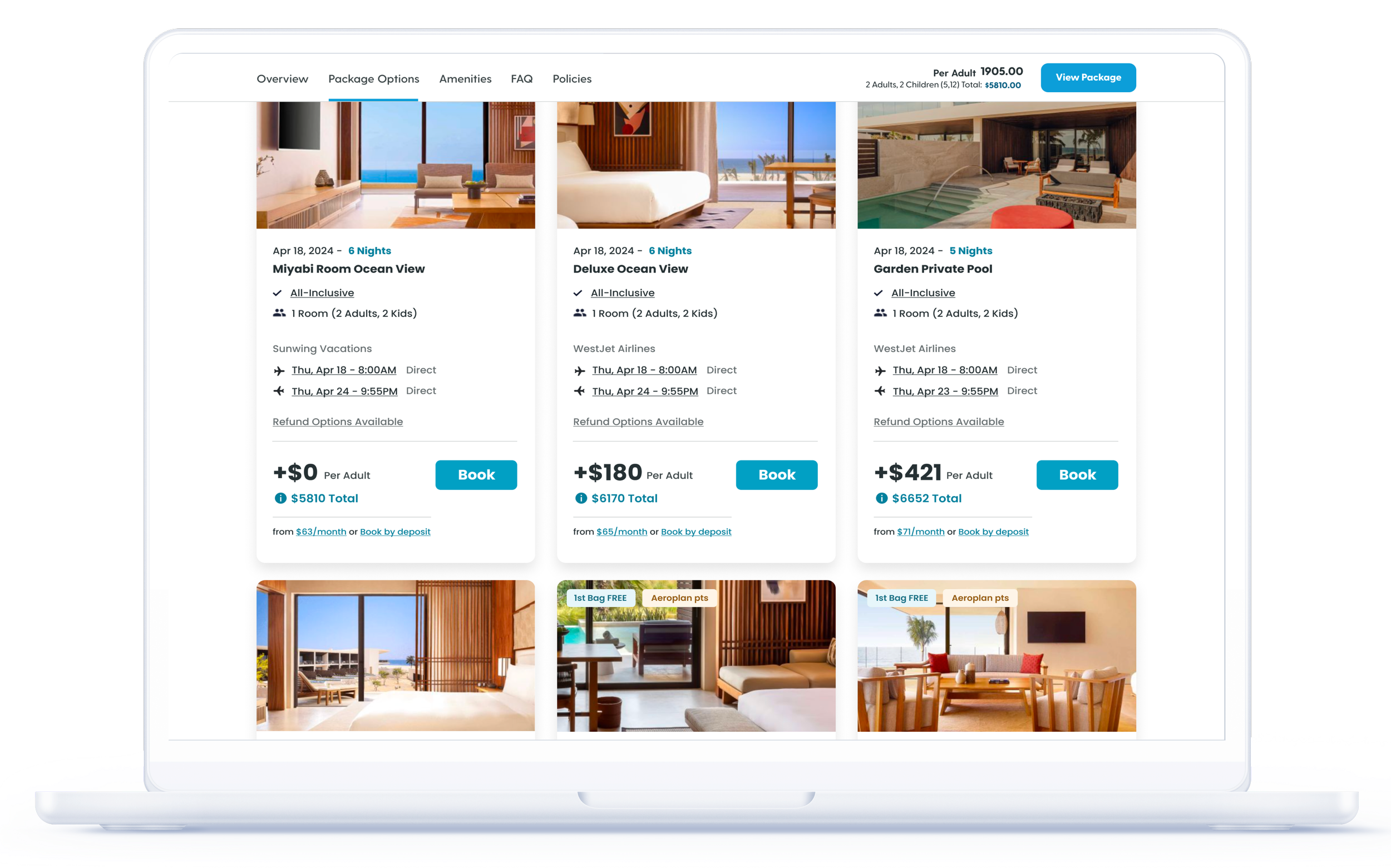
Improving Package Scanability
Explored card design variations to better highlight key package attributes, including trip duration and flight supplier. By increasing the prominence of these differentiators, users could more easily compare options and identify packages that best matched their preferences.
Shortlisted Solutions
Both layouts performed similarly in internal testing, but Option B was selected for grouping key details—departure date, nights, and supplier—into a single, scannable block, unlike Option A, which separated them and reduced clarity.
Option A
Option B
Final Design
Impact
2% Lift in AOV
Following the launch of surfaced room options with differential pricing, Escapes’ average booking value increased by ~2 percentage points above estimated Mexico vacation package inflation, signaling that more customers were selecting premium rooms or higher-value packages.
We estimate that roughly 7–14% of users selected higher-value room options post-launch — aligning closely with the original hypothesis of 5-15%.
Note: Overall AOV grew ~9.2% YoY (Oct 2024 → Oct 2025), with ~7% attributable to general market price increases. This suggests the lift wasn’t driven by pricing alone but by improved visibility and choice architecture influencing upgrade behavior.+16.9% Rev Growth
Following the site redesign and surfacing of premium package options, total revenue grew ~16.9 percentage points above estimated Mexico vacation package inflation, signaling that customers were purchasing higher-value packages and booking more effectively.
Note: Overall revenue grew ~23.9% YoY (Oct 2024 → Oct 2025), with ~7% of that increase attributable to general market price inflation. This demonstrates that the UX and design interventions had a measurable impact on total sales, not just average booking value.