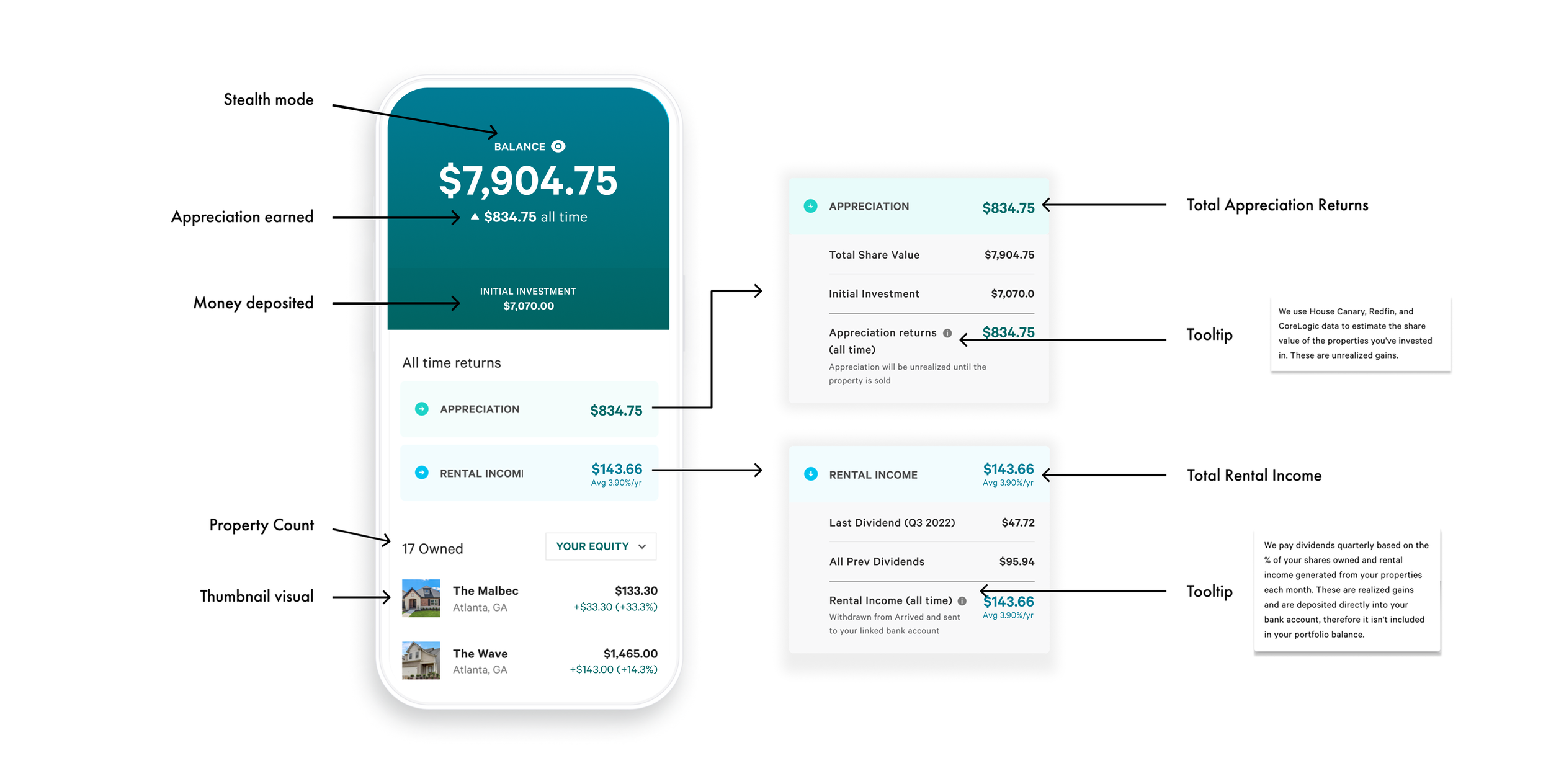
My Assets
Helping customers understand their returns & increasing reinvestment rates
Summary
Arrived is an investment platform that sells fractional shares of real estate. When a customers purchases shares they are then able to monitor their performance within their portfolio.
Our customers could only view their rental income, which drastically understated their portfolio performance leading to confused customers who were not reinvesting. With this surge in customer questions regarding their portfolios performance, we prioritized adding this in as well as optimizing the overall page.
Team: Designer, PM, Engineer
Role: UX/UI Design, User Research
Company: Arrived.com
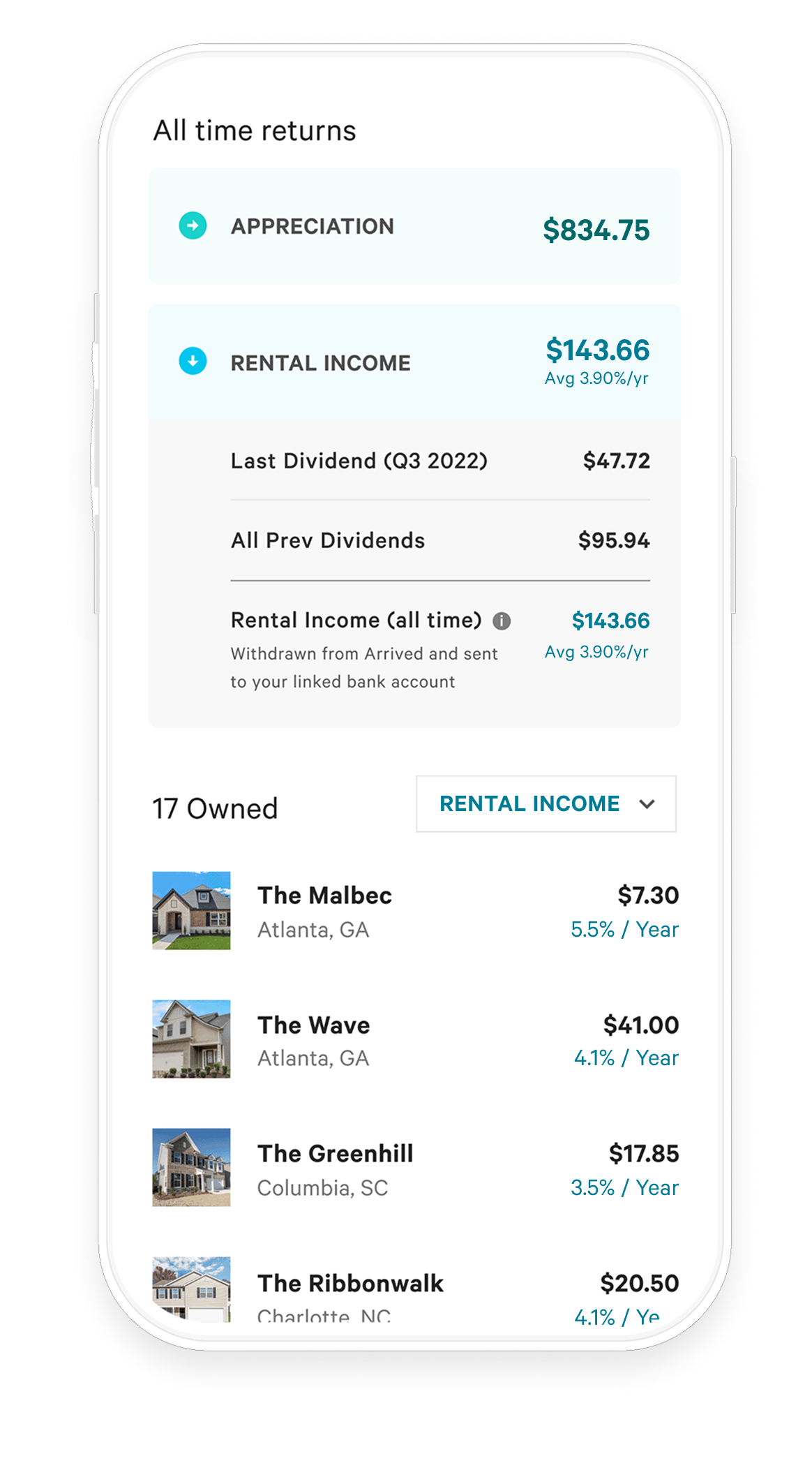
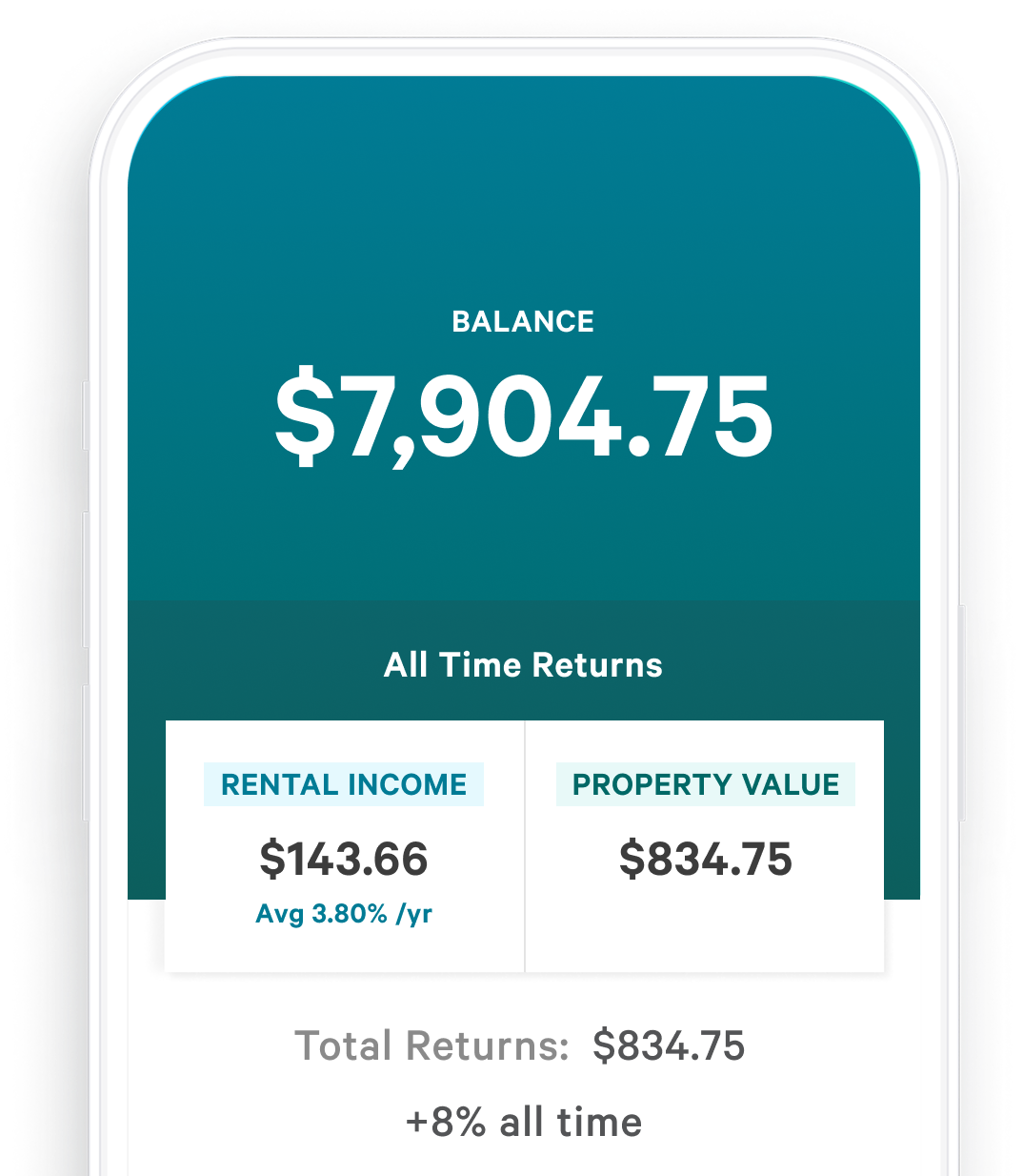
Before


Does not convey appreciation income
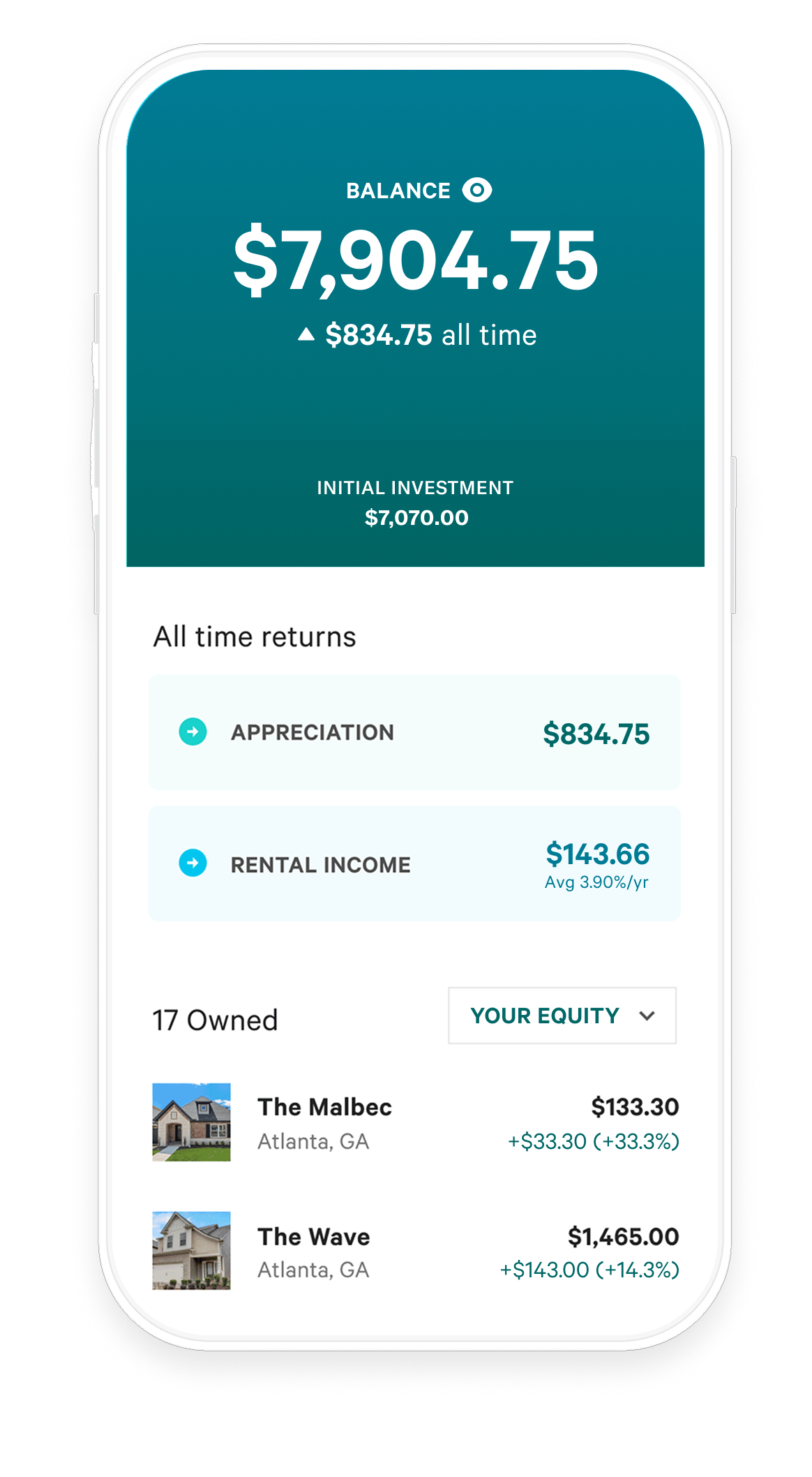
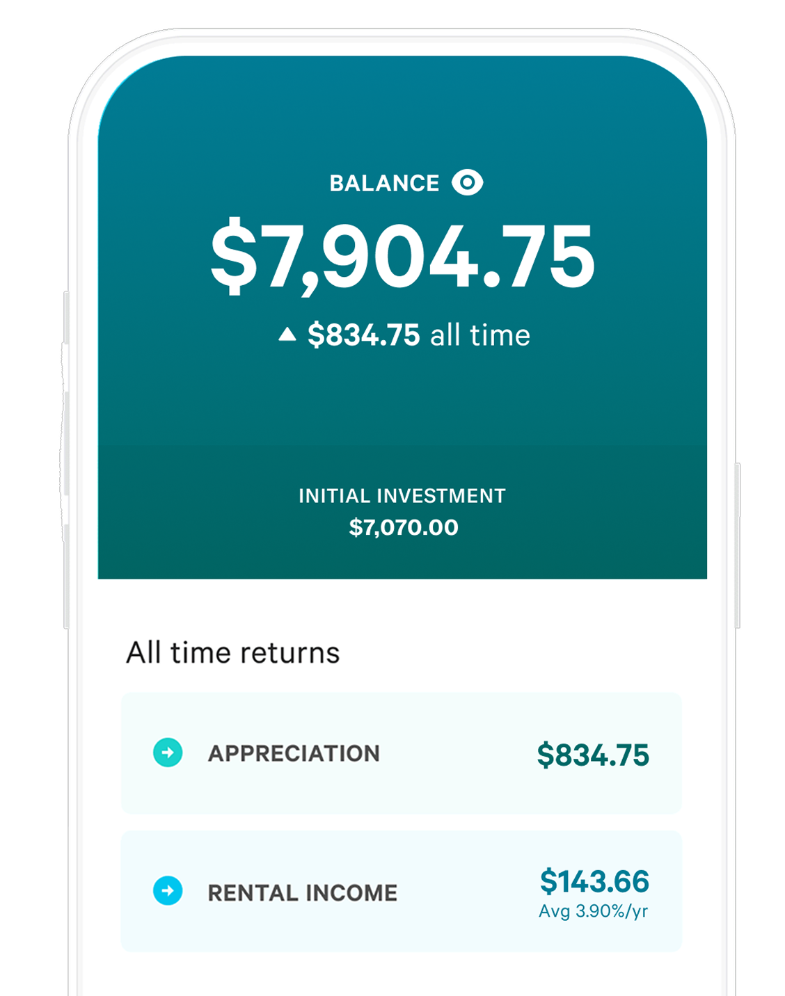
After
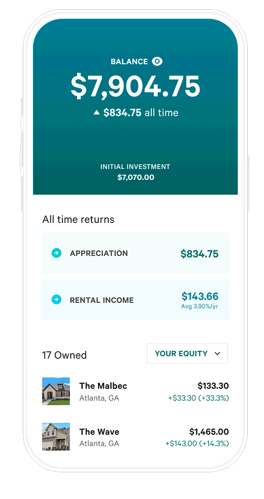

Appreciation Income + optimization
When a customer purchases these shares they make money from these shares in 2 different ways: Property Appreciation and Rental Income. The previous design did not convey appreciation income.

Customer Problem
Customer support chats and interviews has surfaced a lot of confusion and upset from customers who don’t understand how much money they’ve been making. The customers could only view their rental income, which drastically understates the performance of their properties.
Business Problem
Because customers weren’t understanding their portfolio performance, many of them are not continuing to invest in the platform.
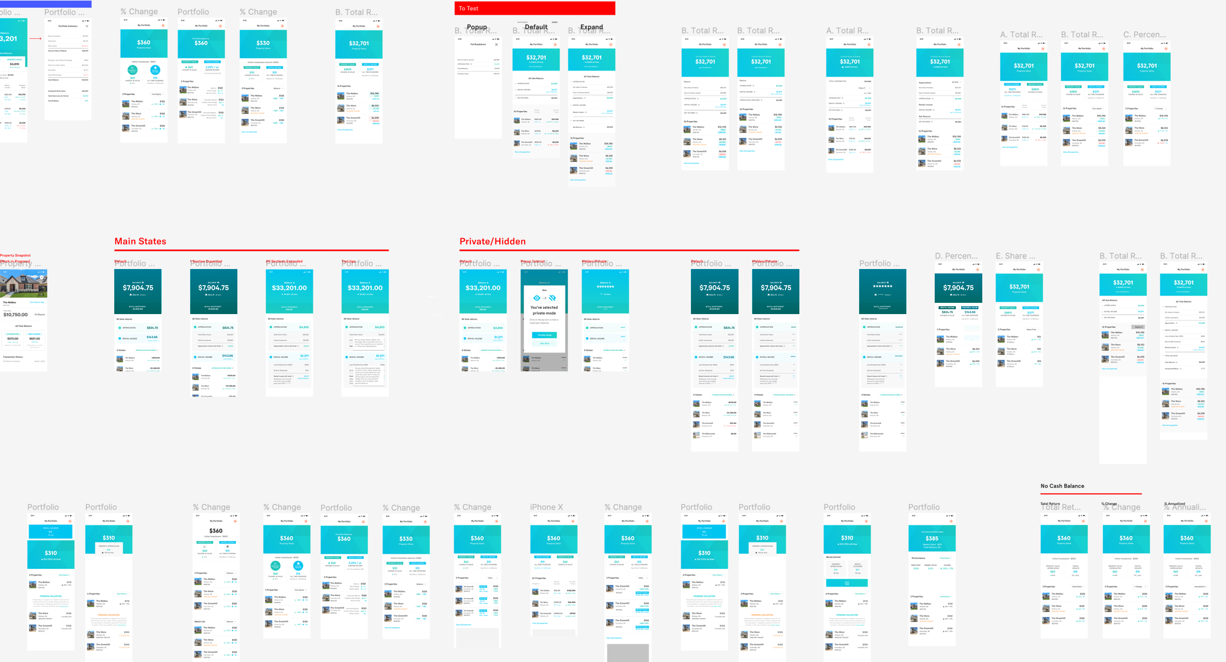
Iteration & initial layouts
Lot’s of collaboration on this took place with the finance and operations team as we were exploring layouts. We experimented with placement and language of the ‘Appreciation returns’ until we came up with a few options we thought most easily explained it.
Does this make sense to a beginner investor?
Because of our prior knowledge and proximity to the project, it made a ton of sense to user test at this point to prevent bias. We shortlisted a few designs and ran a handful of brief testing sessions with people who had generally less financial knowledge.

Previous design did not convey Appreciation Income
Does not easily understand how appreciation income + rental income in calculated into their account balance
Understands the difference between Rental + Appreciation

Previous design did not display appreciation income
Very clear to the user but didn’t scale well when testing character lengths
Understands the difference between
Rental + Appreciation
Breakdown of Elements
Before
After
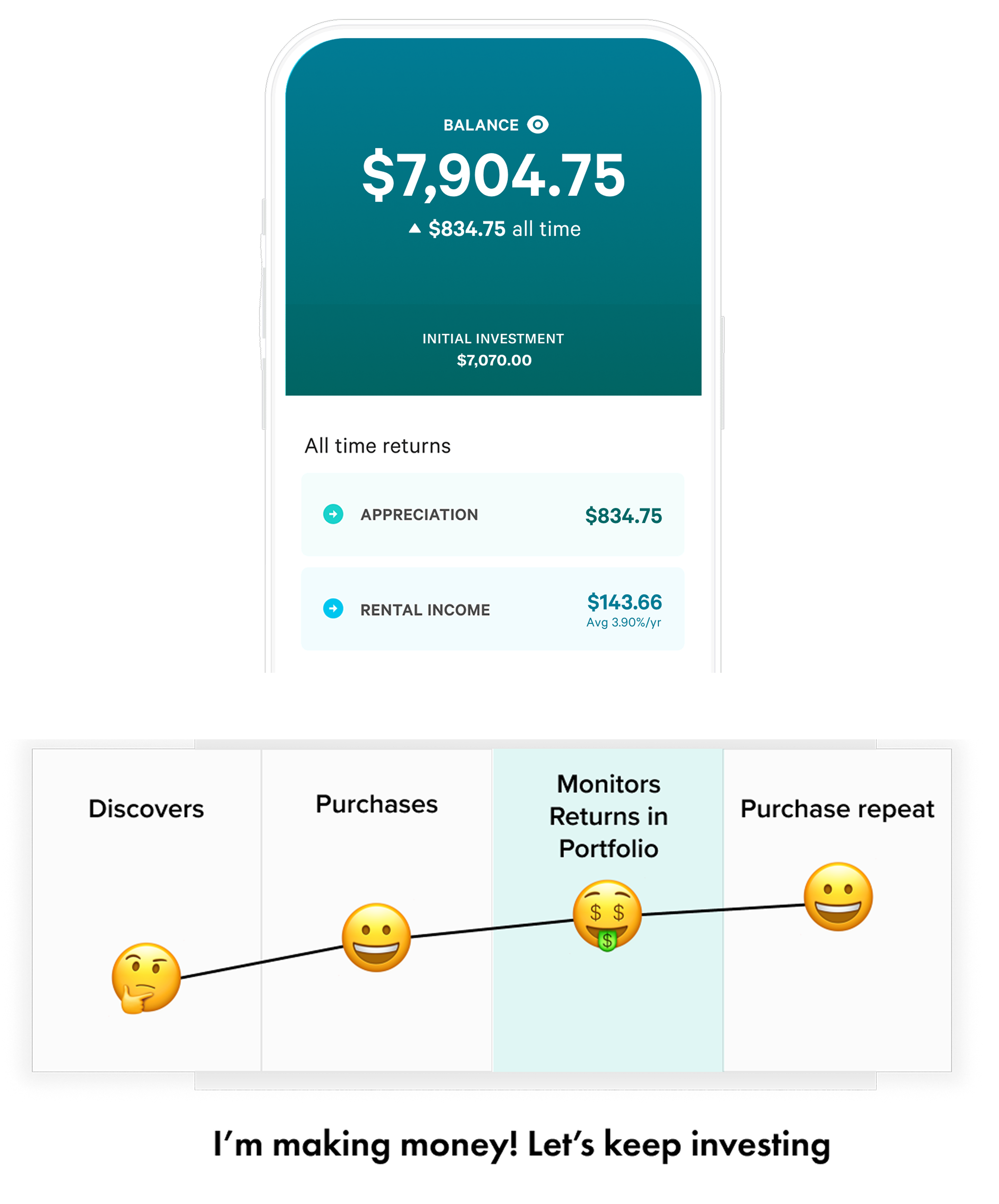

Results

Some of the customer feedback and shoutouts we received on this newly shipped revision
Bonus Feature: Stealth Mode
During my earlier competitive research, I discovered a private mode feature on binance and shakepay and realized this could increase amount of social shares we get (as customers can hide their actual $ amounts). I shared this idea to our team and we launched this feature with the redesign.

Stealth in action
